Title: Tadish Usability Evaluation Design
User Goals:
- Upload and rate individual dishes within one minute
- Find and save three new dishes that they would like to try in the future
- Easily check past history of dishes that the user rated
Scenarios:
Goal 1: Upload and rate individual dishes within one minute
Scenario
Prompt: You’re eating with friends at California Pizza Kitchen and your order of Barbeque Chicken Pizza has just been placed in front of you. You take a picture of the pizza and then take a bite and find that it’s super delicious and that the cheese is delectable. Save your rating of this dish on Tadish. Successful Behavior: Go to the upload rating page and select the gallery option to upload the picture of the dish. Complete the rest of the form and submit the form successfully.
Goal 2: Find and save three new dishes that they would like to try in the future
Scenario 1
Prompt: You’re feeling peckish and bored and would like to choose something to eat tonight. You want to be able to see people’s aggregated ratings of dishes. Go to Tadish and find new dishes to try. Successful Behavior: Navigate to the recommendation page and swipe through all of the dishes for the day.
Scenario 2
Prompt: You’re trying to find a new restaurant to eat with your significant other, however they have a plant based diet and do not enjoy sweet dishes. Use Tadish to find dishes that matches your significant other’s taste and type profile. Successful Behavior: Search through the saved page and filter by food preference (plant based) and look at dishes that have a low “sweetness” scale.
Goal 3: Easily check past history of dishes that the user rated
Scenario
Prompt: A friend coming into your town has asked for recommendations of restaurants they should try. They really enjoy spicy dishes. Use Tadish to find dishes that matches your friend’s taste and type profile with dishes you rated. Successful Behavior: Look through your past rated dishes and look for dishes that you have rated a high “spiciness” scale.
User Types:
TaDish caters to a diverse range of customers facing common dining challenges. The app is designed for
- Dining enthusiasts who struggle to recall specific dishes when revisiting restaurants or those apprehensive about exploring new places without assurance that the cuisine aligns with their preferences.
- Environmentally conscious consumers seeking to minimize food waste
- Health-conscious individuals with specific dietary requirements, such as plant-based, vegetarian, or vegan diets
- Tech-savvy users comfortable with leveraging mobile applications to enhance their dining experiences
Recruitment:
To obtain a half dozen people for each user type, we would utilize word of mouth through friends and family members. Additionally, we will attempt collaborations with restaurants and food influencers.
Tadish: User Survey + Copy of Consent Form
Consent Form: https://forms.gle/RpAbEnGiaQnoNehv7
Description of the participants (at least 5 participants)
Tadish User Survey include 6 participants ranging from dining enthusiasts, health-conscious individuals, and tech-savvy users. All participants are tech-savvy users, participant A and C considered themselves as dining enthusiasts, and participant D and F identifying as health-conscious individuals.
Usability Test Time and Location
The user study took place in-person was conducted by one or two developers. The participants were tasked with using our mobile device or emulator to run through the usability script and detect any underlying issues.
Script of Usability Test
- Please register an account through your google email. After registration, check your email inbox for a confirmation message.
- With the dish you are consuming right now, please upload an image and complete the form within one minute.
- Now it is time to explore new dishes and restaurants. Navigate to the recommendation page and swipe through and save five new dishes you’d like to try.
- For restaurants, go to the surprise page and spin the wheel.
- Imagine your parents are visiting your town and has asked for restaurant recommendations. Browse through your saved and past rated dishes to provide personalized restaurant suggestions based on your preferences.
Raw data
Participant Backgrounds
- Participant A is a tech-savvy, dining enthusiast who used our emulator.
- Participant B is a tech-savvy user who used our emulator.
- Participant C is a tech-savvy user who used our mobile device.
- Participant D is a tech-savvy, health-conscious user who used our mobile device.
- Participant E is a tech-savvy user who used our mobile device.
- Participant F is a tech-savvy, health-conscious user who used our mobile device.
Participants were asked the following questions:
After using Tadish, what is your initial impression of the application?
- Participant A: I think the app is a good idea and can be very convenient, but it’s feels a bit clunky when using it.
- Participant B: pretty good, i can easily see the value of having an app that lets you save ratings for dishes you’ve tried (probably because i don’t go out much)
- Participant C: UI is well layout
- Participant D: Kind of hard to navigate; required lots of instruction
- Participant E: it needs bitter and umami
- Participant F: Interesting concept. I can see it being a useful tool for planning dates/events and coordinating with groups of friends. I like how the app incorporates a social aspect; it reminds me of apps like Instagram and Facebook.
How would you rate the ease of the registration process using your Google email? From 1-5, 1 being “Not easy” and 5 being “Very easy”
- Participant A: Rated a 5.
- Participant B: Rated a 4.
- Participant C: Rated a 4.
- Participant D: Rated a 3.
- Participant E: Rated a 1.
- Participant F: Rated a 4.
Did you encounter any challenges or confusion while uploading an image and rating the dish within one minute?
- Participant A: The process was very straight forward for me.
- Participant B: the image button didn’t look like a button, so i didn’t realize it probably actually was a button until i looked through the rest of the page and didn’t see another button for it. i wasn’t expecting the notes fields or tags (vegan, local, vegetarian) to be required, and it seemed like nothing happened when i didn’t have at least one tag set since no error message displayed (although again, i wouldn’t expect tags to be required, especially with the current set of available tags)
- Participant C: yes, textbox for public and private notes were too small
- Participant D: Not really
- Participant E: I didn’t realize this feature was implemented until i saw this question and went back to click on random stuff
- Participant F: I initially missed the star rating section. I also wasn’t sure what counted as local—locally grown or locally owned or a restaurant in the area you’re living in?
How intuitive was the process of exploring the recommendation page and saving five new dishes for future tries?
- Participant A: I think exploring the recommendation page and saving dishes was simple, but some it was a bit confusing when learning the layout of the app for the first time.
- Participant B: i remember i didn’t realize there was a hamburger menu in the top left until alyssia pointed it out, but maybe i’m just blind and/or dumb… i forget but if there isn’t something to tell you to swipe the page one way to do something and swipe the other way to do some other thing then there definitely needs to be. otherwise, it’s pretty straightforward since it gives a picture and flavor profile levels, though perhaps it would be useful to include a short description of what exactly it is so that we don’t have to guess solely based on the picture (for us less-experienced-with-food folk), it would also be helpful to know if things contain certain ingredients like dairy or gluten but i imagine that would be better suited for the tags
- Participant C: very intuitive
- Participant D: Relatively
- Participant E: intuitive
- Participant F: The process was pretty intuitive. I wasn’t sure what the person symbol signified.
How confident did you feel using your saved and past rated dishes to make restaurant recommendations for your parents visiting your town? From 1-5, 1 being “Not confident at all” and 5 being “Very confident”
- Participant A: Rated a 4.
- Participant B: Rated a 3.
- Participant C: Rated a 5.
- Participant D: Rated a 3.
- Participant E: Rated a 4.
- Participant F: Rated a 4.
Do you think incorporating tags for environmental considerations would influence your food choices?
- Participant A: Neutral
- Participant B: Neutral
- Participant C: Probably
- Participant D: Probably
- Participant E: Probably not
- Participant F: Probably
Tadish helps users find new dishes that align to their personal taste. In your opinion, how effective do you think Tadish could be in minimizing individual and collective food waste (e.g., leftovers) ?
- Participant A: Effective
- Participant B: Effective
- Participant C: Effective
- Participant D: Effective
- Participant E: Neutral
- Participant F: Effective
What features of Tadish do you think contribute to creating a sense of community?
- Participant A: I think the local tag is a good way of creating a sense of community as it shows people locally owned restaurants easily.
- Participant B: didn’t get to see what features are available after adding someone as a friend but most of the app seems more like an individual thing
- Participant C: history and recommendations
- Participant D: Working with friends
- Participant E: The friend system
- Participant F: Being able to friend people and add their preferences to the spin-the-wheel page contributed to creating a sense of community. I also think the “about you” page that’s visible to your friends also contributes to the social aspect.
On a scale of 1 to 10, how would you rate the overall usability of the platform?
- Participant A: 8/10
- Participant B: 8/10
- Participant C: 7/10
- Participant D: 5/10
- Participant E: 9/10
- Participant F: 8/10
Is there anything else you would like to share about your overall impression or thoughts on Tadish?
- Participant A: I like the idea and potential of the app, but I broke it
- Participant B: bottom navbar icons aren’t really intuitive but i’m not sure what could be used instead. maybe for the adding a new dish review it could just be a circled plus sign or something, it would be pretty clear that you’re adding something
- Participant C: comment boxes need to be bigger. User can register using his/her google email
- Participant D: Please make the recommendation part of the app more clear what is and isn’t recommended
- Participant E: looks nice!!
- Participant F: Saved Page - Add a filter dropdown that allows you to choose between various filters (rating, type of dish, flavor, etc.). I also think it would be beneficial to make the colors on the right of the dish actually correspond to specific flavors. Recommendations Page - Add an indicator for which side is which when swiping. It might be helpful to make the person indicator’s meaning more clear. Dish Page - Make star selection section more prominent. Maybe make it restrict you from entering the dish if you don’t interact with the stars first. Also it might be better to make the notes sections optional (at least the private notes). Spin-the-Wheel Page - Make it fit the theme of the app more. Change “Roll” to “Spin” or get rid of the button entirely and solely rely on the swipe-spin feature. Profile Page - Make it more clear what the favorites and history icons mean somehow. Maybe the favorites page could be a collection of the dishes that the user decides to pin instead of dishes the app chooses. Also allow users to add a profile picture and maybe customize their profile further. Sign-Up Page.- Make the meaning of the flavors more clear to new users. What are their functions?
Results
Navbar (link)

For some participants, it wasn’t too clear what the navbar icons meant. Specifically, the adding of a new dish (middle icon) and spin-the-wheel page icon (2nd from right) were the most confusing. This, coupled with no words next to icons unless they look at the hamburger menu led to confusion as to which page was which.
Saved and top dishes (link)
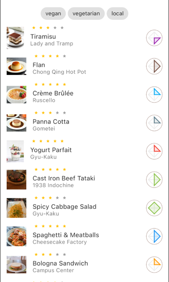
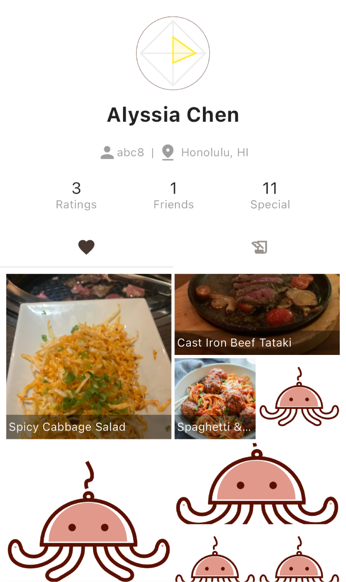
The saved page is supposed to only contain dishes saved after a user swipes right for it on the recommendation page whereas the heart tab on the profile page is supposed to be the most highly rated dishes that a single user had. However, participants thought the heart meant “liked” which could be synonymous with saved so they believed their saved dishes were here instead.
Recommendation swiping (link)
For users who did not use tinder before (a vast majority of our participants), it was difficult for them to know which way to swipe to save or to dismiss. It was suggested to have icons indicating save or dismiss behind the card so as the user is swiping, they know which category they’re putting the dish into.
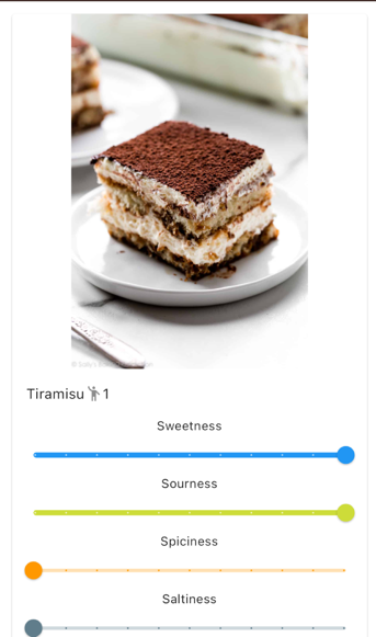
Form modification (link)
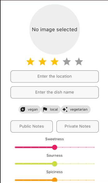
There were a few fields that we particularly monitored: image and star rating. We found that some users were not recognizing that the image circle is a button that can be pressed to upload or take a picture. We also found that they often skipped over the star rating because it didn’t appear to look like one.